Wiz Cloud Demo — Deep UX/UI Analysis for SecurityV0
Source: Wiz Cloud Security Demo (Vimeo 1083440365, ~14 min) Analyzed: 2026-04-03 Purpose: Extract actionable graph interaction patterns, visual design decisions, and information architecture for SV0's NHI security platform. Audience: SV0 product and engineering team
1. Graph Interaction Patterns
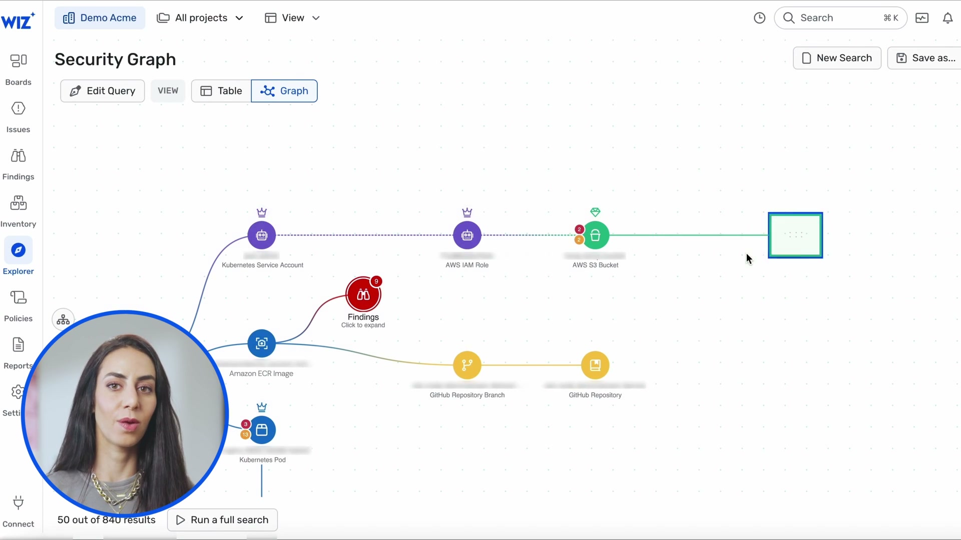
The Security Graph is Wiz's hero feature. Every other view (Issues, Findings, Threats) links back to the graph. The UX is built around a philosophy of progressive disclosure on a canvas -- you never see the full graph, only the parts you ask for.
1.1 Node Types and Visual Language
Each node is a circle with an icon (not a rectangle with text like SV0's current EntityNode). The circle diameter is approximately 40-50px with the icon centered inside. Labels sit below the circle, not inside it. This keeps the graph visually clean at zoom-out levels.
Observed node types and their visual encoding:
| Node Type | Icon Style | Color | Border | Example |
|---|---|---|---|---|
| Kubernetes Service Account | Crown icon | Purple fill | Solid | K8s SA connecting to IAM Role |
| AWS IAM Role | Crown icon | Purple fill | Solid | IAM Role with shield badge |
| AWS S3 Bucket | Lock/bucket icon | Green fill | Solid | S3 bucket at end of attack path |
| AWS EC2 Instance | Compute icon | Green-teal fill | Red alert ring when compromised | EC2 in detection graph |
| Findings (group) | Shield/alert icon | Red fill | Red | "Findings - Click to expand" |
| Data Findings (group) | Data icon | Green fill | Solid | "Data Findings - Click to expand" |
| Amazon ECR Image | Gear icon | Teal fill | Solid | Container image in attack path |
| Kubernetes Pod | Container icon | Blue fill | Solid | Pod linked to Service Account |
| GitHub Repository | Code icon | Gold/yellow fill | Solid | Repo at end of code-to-cloud path |
| GitHub Repository Branch | Branch icon | Gold/yellow fill | Solid | Branch linked to repo |
| Application Endpoint | Globe/network icon | Orange-red fill | Red | Network exposure path endpoints |
| Kubernetes Container | Container icon | Blue fill | Solid with badges | Container with multiple overlays |
| Geographic Origin | Flag icon | Country flag | - | Ashburn US, Dubai UAE |
| Process | Gear icon | Yellow/gold fill | Solid | Process nodes in detection graph |
| Service Account | Person icon | Purple fill | Solid | SA in detection graph |
| AWS Account | Cloud icon | Teal fill | Solid | "Wiz Defend Demo" account node |
| ELB / Load Balancer | Network icon | Red fill | Solid | In network exposure paths |
| Network Interface | Interface icon | Red fill | Solid | In network exposure paths |
| Kubernetes Service | Service icon | Red fill | Solid | In network exposure paths |
| Globe (Internet) | Earth icon | Green fill | - | Internet entry point in exposure paths |
Key design observation: Wiz uses color to encode domain, not severity. Purple = identity/IAM, green = storage/data, red = findings/vulnerabilities, orange = network/endpoints, blue = compute/containers, yellow/gold = code/process. This is consistent across the entire product.
1.2 Badge System
Nodes carry overlay badges positioned at the top-left or top-right:
- Red circle with number -- finding/issue count on the node (e.g., a red "3" badge on a container node means 3 associated findings)
- Crown icon -- IAM/service account indicator
- Shield icon -- security-relevant marker
- Alert triangle -- warning state
Badges are small (12-16px) and semi-transparent, visible but not overwhelming.
1.3 Edge Rendering
Edges are curved or polyline paths with consistent styling:
- Solid lines for direct relationships (SA -> IAM Role, IAM Role -> S3 Bucket)
- Dashed lines for inferred or indirect relationships (across layers)
- Edge labels show API action metadata: "1 x Get", "2 x List", "1 x Create" -- this is unique to Wiz's runtime detection graph and is a powerful UX pattern
- Color-coded edges -- purple for identity chains, green for data paths, red for attack/risk paths, teal/cyan for lateral movement
- Arrow direction indicates data flow or access direction
1.4 Zoom and Pan
- Canvas metaphor -- the graph area is a pannable, zoomable canvas (like Figma/Miro)
- "Meta+Scroll to zoom" helper text at bottom center of canvas (visible in frames 0120, 0121)
- Zoom controls on left sidebar: +, -, fit-to-view buttons (visible in frame 0121)
- No minimap visible in the demo (may exist but not shown)
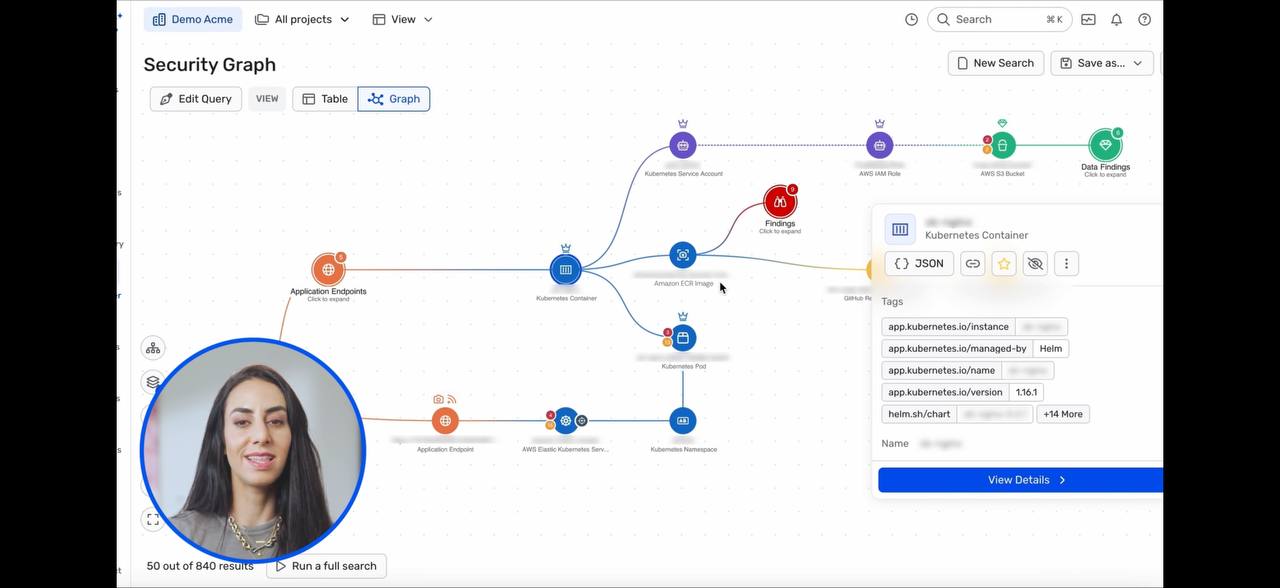
1.5 Node Selection and Detail Panel
Two interaction models observed:
Hover card (inline popup):
- Visible in frames 0019, 0014, 0085
- A compact card appears near the node (not in a sidebar)
- Shows: entity name, type, key tags (truncated), "View Details >" button
- Card has tabs for quick info: JSON view, tags, metadata
- Card floats above the graph -- does not obscure the node being inspected
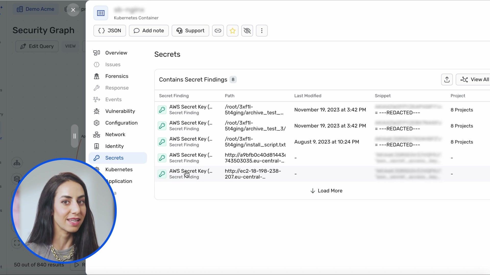
Full detail panel (right sidebar):
- Visible in frame 0015 (Secrets tab), frame 0024 (Code-to-Cloud pipeline)
- Opens when clicking "View Details" from the hover card
- Full-width right panel with extensive tabs: Overview, Issues, Forensics, Response, Events, Activity, Vulnerability, Configuration, Network, Identity, Secrets, Kubernetes, Application, Data, Remediation
- Panel has its own sub-navigation and scrolling
- Graph remains visible (shrinks) behind/beside the panel
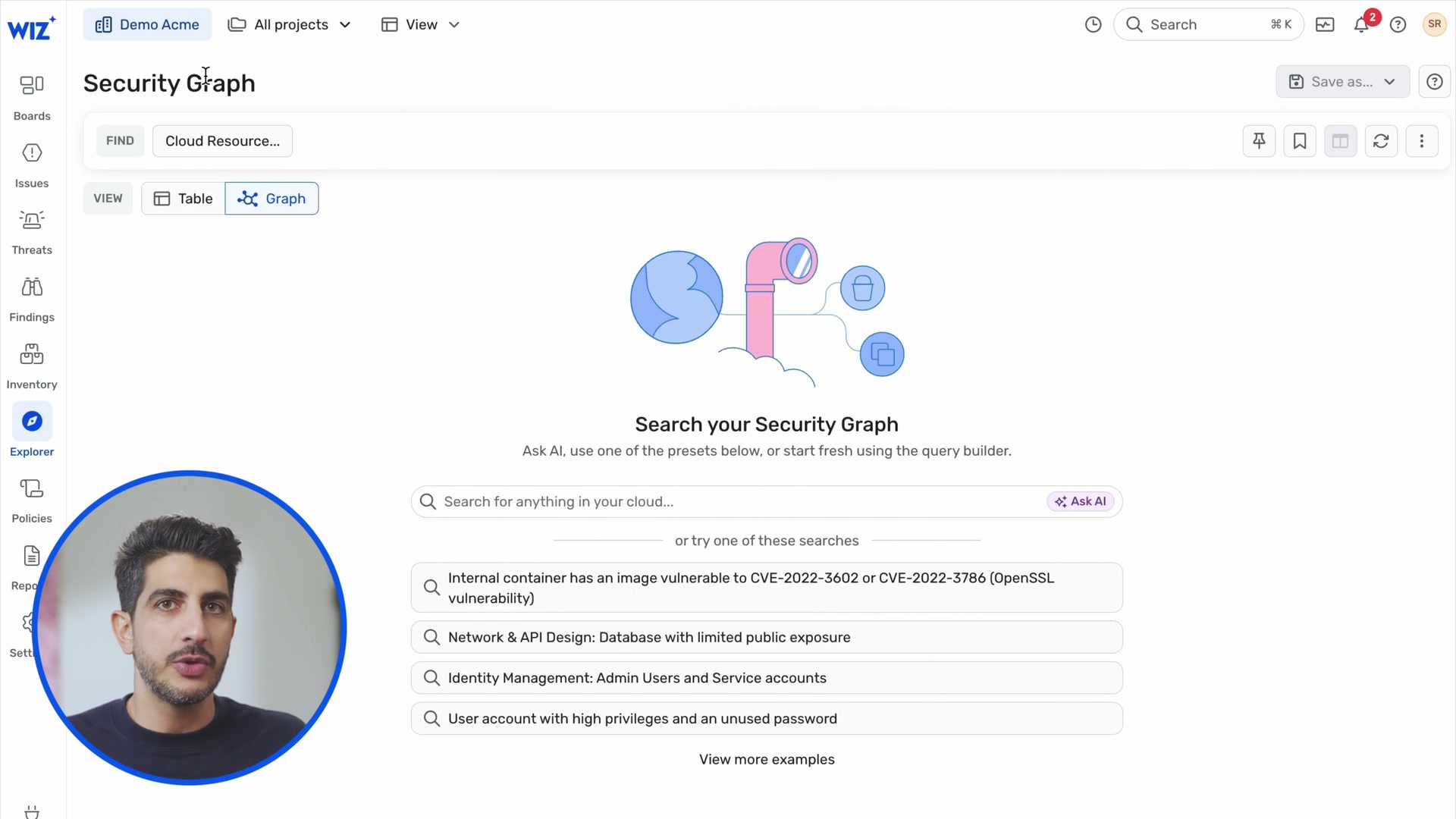
1.6 Query Builder
Visible in frame 0070 (landing page) and frame 0071 (active search):
- Structured query bar at top:
FIND [Cloud Resource...]with type selector - Natural language search field: "Search for anything in your cloud..."
- "Ask AI" button alongside the search field -- two entry points to the same result
- Autocomplete dropdown (frame 0071): shows matching preset queries as user types "publicly e..." -> "Publicly exposed VM with critical vulnerabilities..."
- Preset query cards on landing page: four example searches with descriptive text
- "View more examples" link for additional presets
- VIEW toggle: Table | Graph -- switch between tabular and graph results for same query
1.7 Results Pagination
- "50 out of 840 results" shown at bottom-left of graph canvas (frames 0012, 0020)
- "Run a full search" button next to the count -- lets user explicitly load more
- This is a brilliant progressive disclosure pattern: start with a manageable subset, let the user opt into the full result set
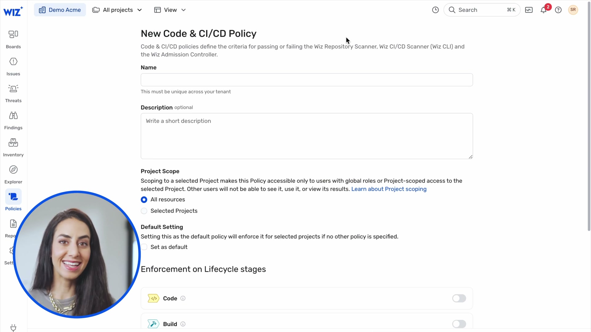
1.8 Graph Controls (Policy/Rules View)
Frames 0073-0077 show a separate "Graph Controls" view:
- Tabular list of security rules/controls with columns: Graph Control name, Issues count, Projects
- Filter bar with dropdowns: Category, Severity, Creator, Risk, Status, Has Issues, More
- Risk filter (frame 0076-0077) shows MITRE ATT&CK kill chain categories: Vulnerability, External Exposure, Unprotected Principal, Insecure Use of Secrets, Unprotected Data, Insecure Kubernetes Cluster, High-Profile Threat, Reliability Impact, Insecure CI/CD, Initial Access, Discovery, Execution, Persistence, Privilege Escalation, Defense Evasion, Credential Access, C2 & Exfiltration, Impact
- Compliance framework filter (frame 0075): HIPAA Security Rules, HITRUST CSF v11.2, ISO/IEC 27001, ISO 27001:2022, IaC Rules, Kubernetes Pod Security Standards (Baseline/Restricted), MITRE ATT&CK Cloud Matrix, NIST 800-53
- "+ Create Control" button and ON/OFF toggle per rule
2. Grouped Node Expansion -- Deep Dive
This is the pattern Ivan called a "gold mine." Three distinct group patterns are visible in the demo:
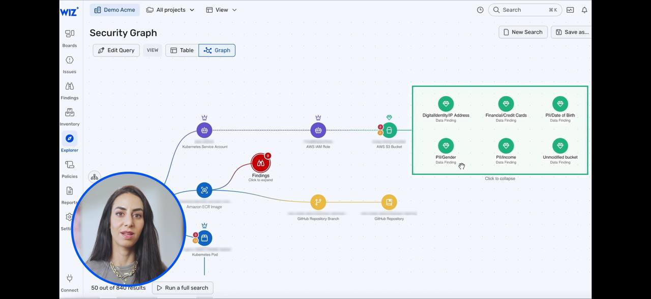
2.1 Findings Group (Frame 0012 collapsed, Frame 0013 expanded)
Collapsed state:
- Single node labeled "Findings" with subtitle "Click to expand"
- Red circle icon with alert marker
- Connected to the main graph path like any other node
- Visually indistinguishable from a regular node except for the "Click to expand" text
Expanded state (Frame 0013):
- A bordered rectangle appears where the single node was
- The rectangle has a dashed blue border with rounded corners
- Inside: 9 individual finding nodes arranged in a 3x3 grid layout
- Each sub-node shows: CVE icon (red shield), CVE ID (e.g., "CVE-2021-36222", "CVE-2021-3711"), and label "Finding" below
- "Click to collapse" text at the bottom center of the rectangle
- The rectangle's edges connect to the same attachment points as the original collapsed node
- The surrounding graph does not re-layout -- the expansion happens in-place, pushing nearby nodes if needed
Layout mechanics:
- Grid arrangement inside the box: equal spacing, ~3 columns
- Rectangle auto-sizes to fit contents
- Edges from the group to external nodes route to the rectangle border, not to individual sub-nodes
- This means the group-to-external edges show the aggregate relationship
2.2 Data Findings Group (Frame 0012 and 0019)
Visible as a green node labeled "Data Findings" with "Click to expand" in the collapsed graph view (frame 0012, top-right area). When expanded, it shows PII category nodes (IP Address, Credit Cards, Date of Birth, etc.) in the same bounded-rectangle pattern.
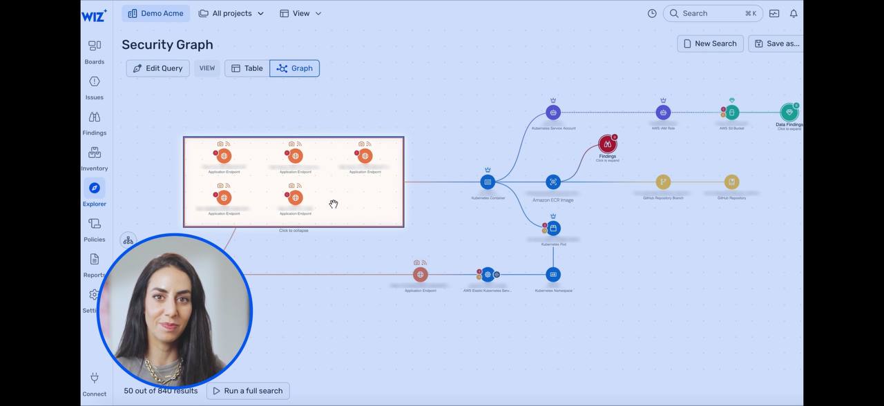
2.3 Application Endpoints Group (Frame 0016)
Expanded state visible in frame 0016 (Network Exposure Paths):
- This is viewed from the node detail panel's "Network" tab, not the main graph
- Shows a horizontal path: Globe -> ELB -> Network Interface -> K8s Service -> Network Interface -> fan-out to 5 Application Endpoint nodes
- Each Application Endpoint is in its own small bounded box with a dashed border
- The boxes are stacked vertically, each containing: icon pair (globe + shield), red badge, "Application Endpoint" label
- Edges from the Network Interface fan out to each endpoint box individually
- This is a different pattern from the grid expansion -- it is a 1:N fan-out where each endpoint gets its own mini-container
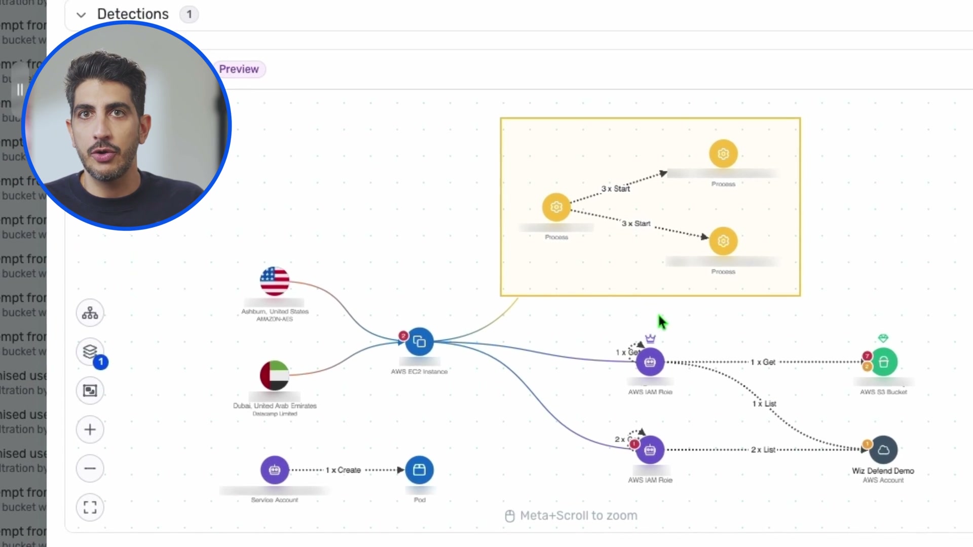
2.4 Process Tree Group (Frames 0120, 0121)
In the Detection/Investigation graph:
- A yellow-bordered rectangle contains process nodes
- Inside: process execution chain showing "3 x Start -> Process" relationships with directional arrows between yellow gear-icon nodes
- The rectangle represents a process tree that happened on a single EC2 instance
- External edges (from EC2 instance to the rectangle) attach to the rectangle's border
- This is a semantic grouping -- processes that ran inside a specific compute context
2.5 Design Rules Extracted
From all four patterns, the grouped node expansion follows consistent rules:
- Collapsed = single node with "Click to expand" subtitle and a count badge
- Expanded = bordered rectangle that replaces the node in-place
- Border style signals group type: dashed blue for findings, dashed orange for endpoints, solid yellow for process trees
- Internal layout is context-specific: grid for homogeneous collections (findings), vertical stack for fan-out (endpoints), directed graph for sequences (process trees)
- External edges attach to the rectangle border, not to individual sub-nodes
- "Click to collapse" text at rectangle bottom for reversal
- Surrounding graph is stable -- the expansion does not trigger a full re-layout, only local displacement
- Animations are smooth -- transition from circle node to expanded rectangle appears animated (can not confirm exact animation from still frames)
3. Information Architecture
3.1 Navigation Structure
Left sidebar (always visible, icon-based):
| Icon | Label | Purpose |
|---|---|---|
| Grid | Boards | Customizable dashboards |
| Alert | Issues | Security issues with severity and remediation |
| Threat | Threats | Runtime threat detection |
| Shield | Findings | Individual findings/vulnerabilities |
| Box | Inventory | Resource and technology inventory |
| Graph | Explorer | Security Graph (the hero feature) |
| Policy | Policies | Graph Controls, CI/CD policies |
| Report | Reports | Generated reports |
| Gear | Settings | Configuration |
| Plug | Connect | Integration hub |
Top bar:
- Tenant selector: "Demo Acme" with dropdown
- Project filter: "All projects" with dropdown for multi-project scoping
- View mode: "View" dropdown
- Global search: magnifying glass + "Cmd+K" shortcut badge
- Notifications bell with count badge
- User avatar
3.2 View Interconnections
Every view links to the graph. The graph is the gravitational center:
3.3 Detail Panel Tab System
The node detail panel uses a rich tab system that varies by entity type. Observed tabs across different entity types:
- Overview -- properties, tags, Code-to-Cloud pipeline
- Issues -- linked security issues
- Forensics -- privilege escalation paths, root cause analysis
- Response -- remediation options
- Events / Activity -- audit log
- Vulnerability -- CVEs, SBOM
- Configuration -- resource config state
- Network -- Network Exposure Paths (inline graph with fan-out)
- Identity -- Lateral Movement Paths (inline graph)
- Secrets -- discovered secrets with redacted previews
- Kubernetes -- K8s-specific metadata
- Application -- application context
- Data -- data classification findings
- Remediation -- "Automatic Fix in Code" with PR generation
3.4 Search and Query Model
Three entry points to the same query engine:
- Global search (Cmd+K) -- keyword search across all entities
- Structured query builder --
FIND [type] WHERE [conditions]with field autocomplete - AI natural language -- "Ask AI" button converts natural language to structured query
The structured query result can be displayed as:
- Table view -- sortable columns, bulk actions, CSV export
- Graph view -- interactive graph canvas with all the patterns described above
3.5 Dashboard Types
Multiple specialized dashboards observed:
- Issues Dashboard (frame 0080): severity donut, open/resolved trend, issue list with group-by controls
- Vulnerability Management (frame 0086): open issues trend, impact stages funnel (200K -> 10K -> 4K -> 108 -> 10), CISA KEV vulnerabilities, top exploitable vulns
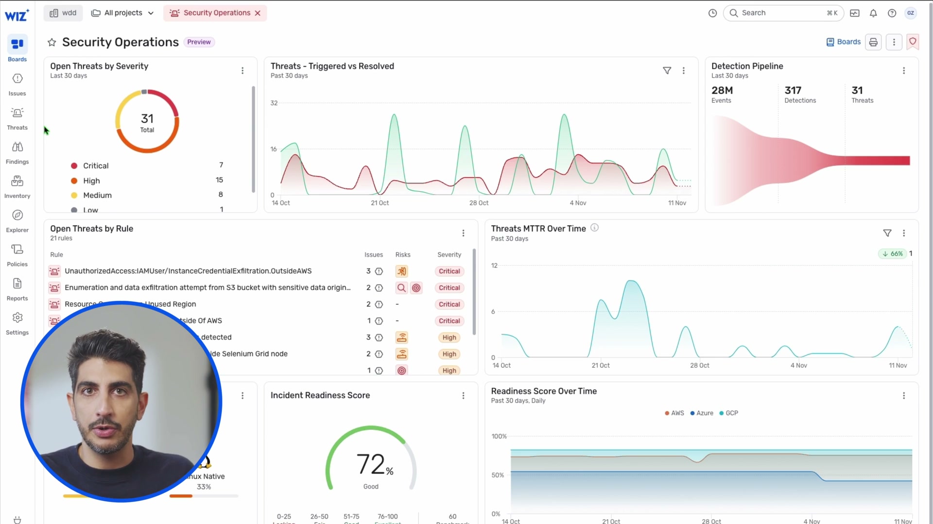
- Security Operations (frame 0110): threats by severity donut, triggered/resolved trend, detection pipeline funnel (28M -> 317 -> 31), MTTR over time, incident readiness score gauge
4. Visual Design System
4.1 Color Palette
Domain-based color coding (consistent across all views):
| Domain | Primary Color | Hex (approximate) | Usage |
|---|---|---|---|
| Identity/IAM | Purple | #7C3AED | IAM roles, service accounts, identity paths |
| Compute | Blue-Teal | #0891B2 | EC2, containers, pods, K8s |
| Storage/Data | Green | #10B981 | S3 buckets, databases, data findings |
| Vulnerabilities/Findings | Red | #EF4444 | CVEs, alerts, critical findings |
| Network/Endpoints | Orange-Red | #F97316 | Application endpoints, load balancers, exposure |
| Code/Process | Gold/Yellow | #F59E0B | Repositories, processes, build artifacts |
| Geographic | Neutral | - | Country flags for origin indicators |
Severity colors:
| Severity | Color | Usage |
|---|---|---|
| Critical | Deep Red | #DC2626 |
| High | Orange | #F97316 |
| Medium | Yellow | #EAB308 |
| Low | Blue-Gray | #6B7280 |
4.2 Typography
- Headings (page titles): ~20-24px, semibold, dark gray (#1F2937)
- Section headers: ~16-18px, medium weight
- Body text: ~14px, regular weight, medium gray
- Labels on graph nodes: ~11-12px, medium weight, positioned below node circles
- Edge labels: ~10-11px, light weight, positioned along edge midpoints
- Badge text: ~10-11px, bold, white-on-color
4.3 Iconography
Wiz uses a custom icon set (not standard lucide/heroicons):
- Filled circles with white icons for graph nodes
- Each entity type has a unique, recognizable icon
- Icons are simple silhouettes (crown for IAM, lock for storage, globe for network, gear for process)
- The icon set is small (~20-25 unique icons) but highly consistent
4.4 Component Patterns
- Pill badges for tags: rounded, small, light background with border
- Status badges: colored rectangles with white text (Critical = red, High = orange)
- Donut charts for severity breakdowns (with total count in center)
- Area/line charts for trends (with filled area under line)
- Funnel visualizations for pipeline stages (28M events -> 317 detections -> 31 threats)
- Gauge for readiness scores (circular, percentage-based)
- Toggle switches for on/off states (policies, enforcement stages)
- Stepped wizard for multi-step creation flows (project setup, policy creation)
- PiP (picture-in-picture) for the demo itself -- presenter circle overlay on UI
4.5 Spacing and Layout
- Left sidebar: ~60px wide (icon-only mode), expands on hover or click
- Main content: full remaining width
- Detail panels: ~400-500px right sidebar when open
- Graph canvas: fills available space, no fixed dimensions
- Card padding: ~16-20px internal padding
- Section spacing: ~24-32px between major sections
- Dense tables: ~40px row height with tight padding
5. Specific Recommendations for SV0
Priority 1: Critical (Implement Now)
5.1 Grouped Node Expansion for Authority Paths
Wiz pattern: Click-to-expand grouped nodes with bordered rectangle containers.
SV0 mapping: This maps directly to SV0's authority path model. When an authority path has multiple credentials reaching the same resource, or multiple roles granting access, these should collapse into a single group node.
Specific implementation:
- Use ELK.js compound graphs (
elk.hierarchyHandling: "INCLUDE_CHILDREN") -- this is already identified in ADR-011 as "Phase 2" - ReactFlow's
parentId+hiddenpattern for expand/collapse - Group by: entity partition (credentials, roles, permissions, resources)
- Collapsed node shows: type label + count badge ("5 Credentials")
- Expanded rectangle shows: grid layout for homogeneous collections, directed graph for execution chains
- Border color matches the entity type color from the existing color system
- "Click to collapse" affordance at bottom of rectangle
- Auto-collapse threshold: When a partition has >5 nodes, default to collapsed
Why now: ADR-011 already planned this. The ELK.js migration is done. The infrastructure is ready. This is the single highest-impact visual improvement for SV0's graph.
5.2 Hover Card for Node Quick-View
Wiz pattern: Compact floating card on node click/hover showing key properties without leaving the graph.
SV0 current state: GraphNodeDetailsDrawer opens a drawer below the canvas. This pulls attention away from the graph context.
Recommendation:
- Add a floating card (250-300px wide) that appears near the clicked node
- Show: entity name, type badge, source system badge, finding count, "View Details >" link
- Keep the drawer for full detail view
- The card should not obscure the selected node -- position it to the right or below
- Dismiss on click-away or Escape
5.3 Table <-> Graph View Toggle
Wiz pattern: Every query result is viewable as both a table and a graph, toggled with a single click.
SV0 current state: Graph Explorer and entity list pages are separate routes. There is no toggle between them.
Recommendation:
- Add a VIEW toggle (Table | Graph) to the Graph Explorer page
- Table view should use
@tanstack/react-tablewith the same data the graph renders - Columns: Entity Name, Type, Source System, Status, Finding Count, Connections
- Row click = same as node click in graph view
- This is critical for bulk triage workflows -- security analysts need both views
5.4 Progressive Results Loading
Wiz pattern: "50 out of 840 results" with "Run a full search" button.
SV0 current state: Graph Explorer loads up to 200 entities (useEntities({ limit: 200 })). No indication of total count or ability to load more.
Recommendation:
- Show "N of M entities" count on the graph canvas (bottom-left)
- When graph has >50 nodes, default to showing only the highest-risk subset
- "Show all" button to expand to full result set
- This prevents graph overload while keeping the full data accessible
Priority 2: High (Implement in Next Sprint)
5.5 Natural Language + Structured Search Dual Entry
Wiz pattern: Search bar with "Ask AI" alongside structured FIND ... WHERE builder. Preset queries on landing page.
SV0 mapping: The Graph Explorer page currently has filters but no search bar. No preset queries.
Recommendation:
- Add a search bar to the Graph Explorer landing page
- Preset query cards: "Orphaned service accounts with admin access", "Cross-system paths reaching sensitive resources", "Dormant identities with active credentials", "Authority paths with unproven execution"
- These presets should be hardcoded initially (not AI-generated) -- deterministic, auditable
- Each preset maps to specific filter combinations on the existing API
- "Ask AI" can be deferred to post-MVP, but the preset cards and structured search should ship now
5.6 Edge Labels Showing Relationship Metadata
Wiz pattern: Edge labels like "1 x Get", "2 x List", "1 x Create" showing API action types.
SV0 mapping: SV0 edges are typed (OWNED_BY, HAS_ROLE, GRANTS, etc.) but the labels are generic. For authority paths, edges could show permission specifics.
Recommendation:
- Show relationship type labels on edges in the graph (already planned but verify implementation)
- For GRANTS edges, show the specific permission scope
- For EXECUTES_ON edges, show the execution evidence type
- Keep labels short (truncate to ~20 chars, full text on hover)
- Use a smaller, lighter font weight than node labels to maintain visual hierarchy
5.7 Inline Mini-Graphs in Detail Pages
Wiz pattern: Attack Path Visualization embedded directly in the Issues detail page. Network Exposure Paths embedded in the Network tab. Investigation Graph embedded in the Threats detail page.
SV0 current state: MiniGraph component exists but is only used in the Entity Detail graph tab.
Recommendation:
- Embed authority path graph directly in the Finding Detail page (not just a link to Graph Explorer)
- Embed ownership chain as a mini-graph in the Entity Detail ownership tab
- Each inline graph should have a "View on Graph Explorer" button to open the full context
- These inline graphs should support the grouped node expansion pattern
5.8 Detection Pipeline Funnel
Wiz pattern: 28M events -> 317 detections -> 31 threats. Instantly communicates signal-to-noise ratio.
SV0 mapping: SV0 has a processing pipeline: ingested entities -> evaluated -> findings. This funnel exists in data but is not visualized.
Recommendation:
- Dashboard should show: "X entities ingested -> Y evaluated -> Z findings (N critical)"
- Use a horizontal funnel or stepped bar chart
- This communicates platform value at a glance -- "we processed 10,000 entities and surfaced 47 critical findings"
Priority 3: Medium (Plan for Future Sprints)
5.9 Remediation Actions from Graph Context
Wiz pattern: "Automatic Fix in Code" with "Open a Pull Request to fix vulnerabilities in 7 code libraries" (frame 0095). Remediation is directly actionable from the finding detail.
SV0 mapping: SV0 findings have recommended_actions[] but these are text descriptions, not actionable buttons.
Recommendation:
- For findings with clear remediation paths (orphaned_ownership -> assign owner, dormant_authority -> review and disable), add action buttons
- "Assign Owner" button on orphaned_ownership findings
- "Create Review Task" button that integrates with ticketing (Jira, ServiceNow)
- Keep the read-only constraint for source systems -- actions should create tasks in SV0 or ticketing systems, never modify source systems directly
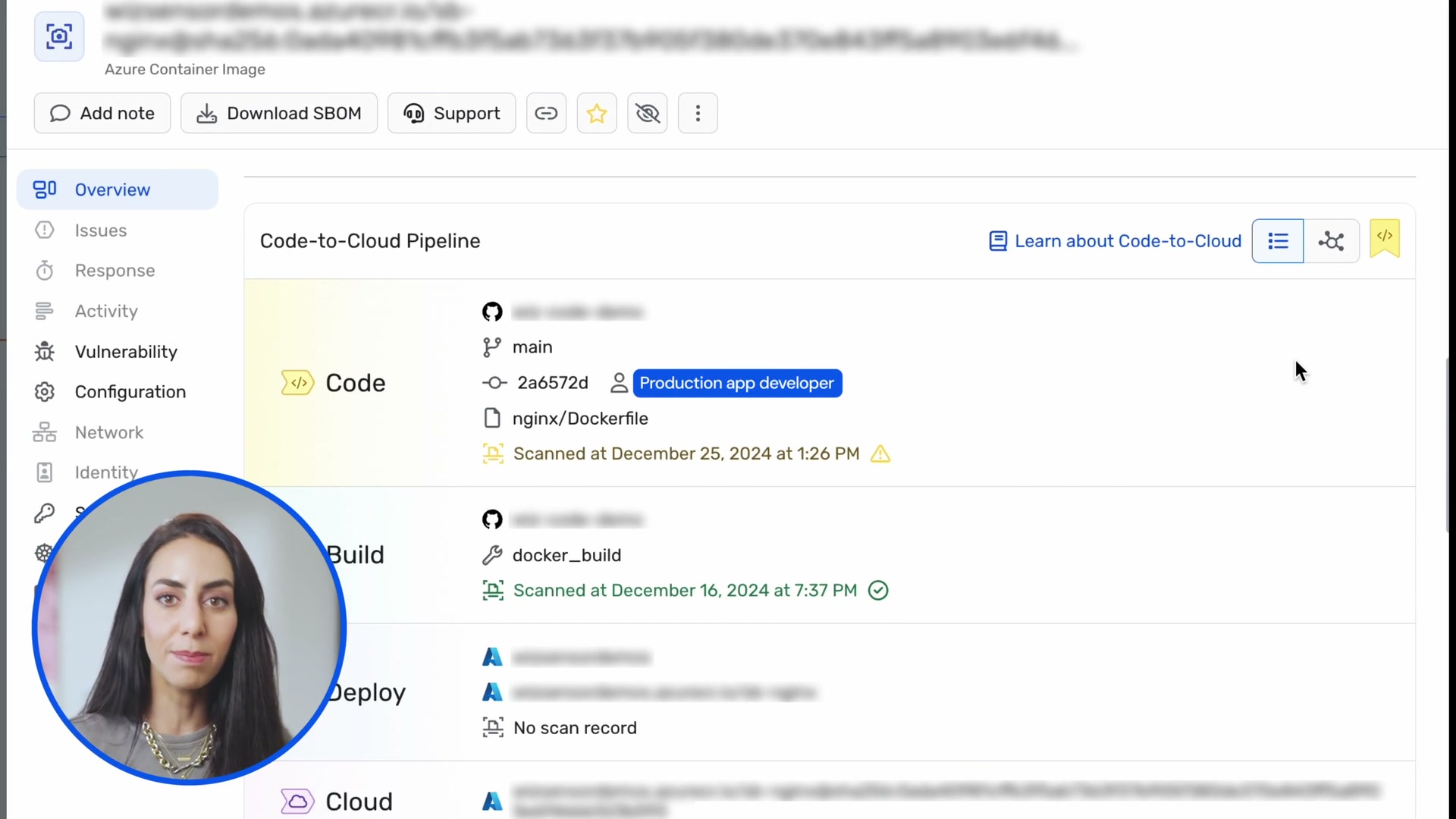
5.10 Code-to-Cloud / Identity-to-Resource Lineage View
Wiz pattern: Visual pipeline showing Code -> Build -> Deploy -> Cloud with stage details and scan status at each stage (frames 0023-0025).
SV0 mapping: SV0's authority path already traces owner -> identity -> credential -> resource -> workload. This is a similar lineage concept.
Recommendation:
- Add a "Path Pipeline" view for authority paths: a horizontal stepped visualization showing each entity in the chain with metadata at each stage
- Each stage shows: entity name, source system, last sync, finding count
- Gaps in the chain (e.g., "No execution evidence") should be visually flagged (like Wiz's "No scan record" in Deploy stage)
- This complements the graph view with a linear, easier-to-read representation
5.11 Compliance Framework Mapping
Wiz pattern: Graph Controls filtered by compliance framework (HIPAA, ISO 27001, NIST, MITRE ATT&CK). Each control maps to multiple frameworks.
SV0 current state: compliance-mapping.ts exists with framework mappings.
Recommendation:
- Add compliance framework badges to findings and authority paths
- Filter findings by framework: "Show all findings relevant to ISO 27001"
- This is a significant enterprise sales enabler
5.12 Incident Readiness Score / Posture Score
Wiz pattern: "Incident Readiness Score: 72%" gauge (frame 0110).
SV0 mapping: SV0 could derive an NHI security posture score from: percentage of owned identities, percentage of identities with execution evidence, mean finding severity, credential rotation compliance rate.
Recommendation:
- Single number posture score on the dashboard
- Gauge visualization (0-100%)
- Trend line showing improvement over time
- Breakdown by contributing factor
- Keep the score deterministic (weighted sum with configurable weights, not ML)
Priority 4: Consider (Not Urgent)
5.13 Geographic Origin in Attack Paths
Wiz pattern: Country flags (Ashburn US, Dubai UAE) as geographic origin nodes in detection graphs (frame 0120).
SV0 mapping: Less relevant for NHI (service accounts don't have geographic origins), but useful if SV0 adds runtime detection for API access patterns from unusual locations.
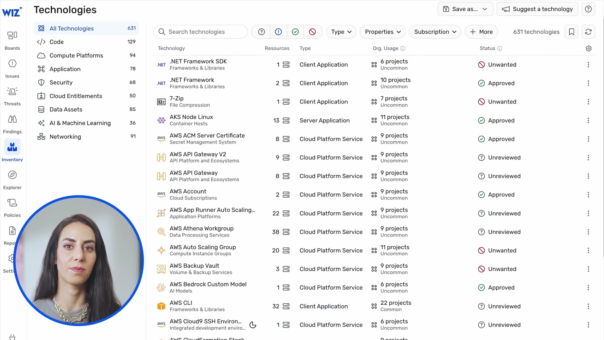
5.14 Technology Inventory with Approval Workflow
Wiz pattern: 631 technologies auto-discovered, each with Approved/Unreviewed status (frame 0050).
SV0 mapping: Auto-discovered NHI inventory with security team review status. "We found 247 service accounts -- 180 reviewed, 67 pending review."
5.15 SBOM Download
Wiz pattern: "Download SBOM" button on container image detail (frame 0023).
SV0 mapping: "Download Evidence Pack" as JSON/Markdown already exists. Consider adding a machine-readable NHI inventory export (CSV/JSON) as the equivalent of an "NHI Bill of Materials."
6. Accessibility and Usability Concerns
6.1 Issues Wiz Gets Wrong
Color-only encoding: Node types are distinguished primarily by color. For colorblind users, purple vs blue vs teal nodes would be difficult to differentiate. Wiz partially mitigates this with unique icons per type, but the icons are small (12-16px inside circles) and may not be distinguishable at zoom-out levels.
Dense graph readability: The full attack path graphs (frames 0012, 0016, 0120) become visually dense. Edge labels overlap, node labels overlap, and the overall structure is hard to parse without zooming in. The grouped node pattern helps, but the base layout still suffers from clutter at high node counts.
Small text: Edge labels ("1 x Get", "1 x Create") and node subtypes are very small (~10-11px). At the zoom levels shown in the demo, these are barely readable. No evidence of text scaling with zoom level.
No keyboard navigation visible: The demo shows only mouse interaction. No visible focus indicators, keyboard shortcuts for graph navigation, or screen reader support. This is a significant accessibility gap for a security tool used in enterprise environments.
Detail panel information overload: The node detail panel has 10+ tabs (Overview, Issues, Forensics, Response, Events, Activity, Vulnerability, Configuration, Network, Identity, Secrets, Kubernetes, Application, Data, Remediation). For a new user, this is overwhelming. No visible progressive disclosure within the panel itself.
No undo/back in graph exploration: Once you expand a group or navigate deeper into the graph, there is no visible "back" or "undo" action beyond collapsing groups one at a time. A breadcrumb trail or exploration history would help.
6.2 Lessons for SV0
Always pair color with shape: Every entity type should have a unique icon AND a unique color. The icon should be legible at 50% zoom. SV0's current rectangular nodes with text labels are actually better for accessibility than Wiz's icon-in-circle approach -- consider a hybrid: colored rectangles with an icon prefix and text label.
Provide text alternatives: Edge relationship types should be available as text labels, not just color-coded lines. SV0 already uses dashed/solid/dotted line styles per ADR-011, which is good.
Limit visible complexity: Default to collapsed groups for any partition with >5 nodes. Auto-zoom to fit the visible graph after expand/collapse operations. Show a node count indicator so users know the graph complexity before diving in.
Support keyboard navigation:
- Tab to move between nodes
- Enter to select/expand a node
- Escape to deselect/collapse
- Arrow keys for directional navigation between connected nodes
- "/" to focus the search bar
Progressive disclosure in detail panels: SV0's current tab system (Properties, Graph, Timeline, Ownership, Findings) is more manageable than Wiz's 10+ tabs. Keep it focused. Only add tabs when there is a clear user need.
Add exploration breadcrumbs: When a user navigates from a finding to an entity to a graph view, show a breadcrumb trail: "Finding > Entity > Graph Explorer" with back-navigation at each step. SV0 already has breadcrumbs in the main content area (mentioned in 07-ui-reporting.md) -- ensure they persist during graph exploration.
6.3 Performance Considerations
Wiz shows a loading spinner (frame 0022) when transitioning between views or loading graph data. This is appropriate for graph operations. SV0's ELK.js migration already handles async layout with a spinner overlay while keeping previous layout visible.
Lazy loading of sub-graph data: Wiz loads 50 of 840 results by default. SV0 should implement similar lazy loading -- load the seed entity's 2-hop neighborhood first, let the user expand further on demand.
Web Worker for layout: Already implemented in SV0 per ADR-011. Confirmed as the right approach.
7. Summary: SV0 vs Wiz Feature Matrix
| Feature | Wiz (Current) | SV0 (Current) | SV0 (Recommended) | Priority |
|---|---|---|---|---|
| Graph visualization | ReactFlow-like canvas | @xyflow/react + ELK.js | Keep current stack | Done |
| Grouped node expansion | Bounded rectangles with click-to-expand | Not implemented | ELK compound graphs + ReactFlow parentId | P1 |
| Node hover card | Floating popup with key info | Drawer below canvas | Add floating card, keep drawer for full detail | P1 |
| Table <-> Graph toggle | Single toggle on query results | Separate pages | Add VIEW toggle to Graph Explorer | P1 |
| Progressive results loading | "50 of 840" with "Run full search" | Fixed 200 limit | Count indicator + "Show all" | P1 |
| Search with presets | AI + structured + presets on landing | Filter sidebar only | Preset cards + structured search bar | P2 |
| Edge metadata labels | "1 x Get", "2 x List" | Relationship type only | Add permission/action labels on edges | P2 |
| Inline mini-graphs | In Issues, Threats, Inventory detail | Entity detail only | Add to Finding Detail, Authority Path Detail | P2 |
| Pipeline funnel viz | 28M -> 317 -> 31 | Not implemented | Entity -> Evaluated -> Findings funnel on dashboard | P2 |
| Remediation actions | "Auto-fix in Code" PR generation | Text recommendations | Action buttons for common remediations | P3 |
| Lineage pipeline view | Code -> Build -> Deploy -> Cloud | Not implemented | Owner -> Identity -> Credential -> Resource stepped view | P3 |
| Compliance framework filter | HIPAA, ISO 27001, NIST, MITRE | compliance-mapping.ts exists | Framework badges on findings, filter by framework | P3 |
| Posture score | Incident Readiness Score gauge | Not implemented | NHI Posture Score (deterministic weighted sum) | P3 |
8. Implementation Notes for Engineering
8.1 Grouped Node Expansion (P1) -- Technical Approach
The ELK.js compound graph feature is the foundation. Here is the approach:
-
Data model: Each node in the graph can have an optional
parentId. Nodes sharing aparentIdare children of a group. -
Group identification logic: When building the ReactFlow node array from subgraph data, detect when a partition has >N nodes (configurable, default 5). Create a synthetic group node as the parent.
-
ELK configuration: Add
elk.hierarchyHandling: "INCLUDE_CHILDREN"to the layout options. Each group node becomes an ELK compound node with children. -
ReactFlow rendering:
- Group nodes use
type: 'group'with a customGroupNodecomponent (bordered rectangle with label and count) - Child nodes set
parentIdto the group node's ID - Children have
hidden: truewhen collapsed - On expand click: set children
hidden: false, re-run ELK layout - On collapse click: set children
hidden: true, re-run ELK layout
- Group nodes use
-
Edge routing: ELK handles edge routing across compound boundaries correctly. Edges from a child inside a group to a node outside the group will route through the group's border.
-
Reference: ReactFlow's Sub Flows example and Expand and Collapse example provide the implementation patterns.
8.2 Hover Card (P1) -- Technical Approach
- Use ReactFlow's
onNodeClick(already in use) to capture click position - Render a floating
<div>positioned relative to the clicked node's viewport coordinates - Use
ReactFlow.screenToFlowPosition()for coordinate mapping - Auto-position: prefer right of node, fall back to left/below if near viewport edge
- Dismiss on: click outside, Escape key, clicking another node, zoom/pan
8.3 Design Tokens to Add
Based on Wiz's visual patterns, SV0 should define these additional design tokens:
// Group node styling
const GROUP_BORDER_COLORS: Record<EntityType, string> = {
  credential: '#6B7280',   // gray dashed border
  role: '#8B5CF6',         // purple dashed border
  permission: '#F59E0B',   // amber dashed border
  resource: '#EF4444',     // red dashed border
  // ... etc
};

const GROUP_NODE_DEFAULTS = {
  borderStyle: 'dashed',
  borderWidth: 2,
  borderRadius: 12,
  padding: 16,
  labelFontSize: 12,
  collapsedSize: { width: 140, height: 60 },
};
Appendix: Key Frame Reference
| Frame | Content | Relevance |
|---|---|---|
| 0009 | Motion graphic: graph node cluster with Code->Pipeline->Cloud->Runtime | Conceptual graph animation |
| 0012 | Full Security Graph with collapsed "Findings" and "Data Findings" groups | Gold mine -- collapsed group pattern |
| 0013 | Expanded "Findings" group: 9 CVE nodes in 3x3 grid inside bordered rectangle | Gold mine -- expanded group pattern |
| 0014 | Full graph with node detail popup card (Kubernetes Container) | Hover card pattern |
| 0015 | Node detail right panel showing Secrets tab with redacted findings | Full detail panel |
| 0016 | Network Exposure Paths with expanded Application Endpoint fan-out | Fan-out group pattern |
| 0017 | Lateral Movement Paths (Identity tab) -- multi-hop identity graph | Identity-centric subgraph |
| 0019 | Full graph with node hover card showing tags and "View Details >" | Hover card pattern |
| 0020 | Security Graph with attack path: K8s SA -> IAM Role -> S3 Bucket | Core attack path rendering |
| 0023 | Code-to-Cloud Pipeline: Code -> Build -> Deploy -> Cloud stages with scan info | Lineage pipeline UX |
| 0024 | Code-to-Cloud full detail with Image Layers | Detailed lineage view |
| 0025 | Code-to-Cloud Pipeline overview (zoomed in) | Pipeline stage design |
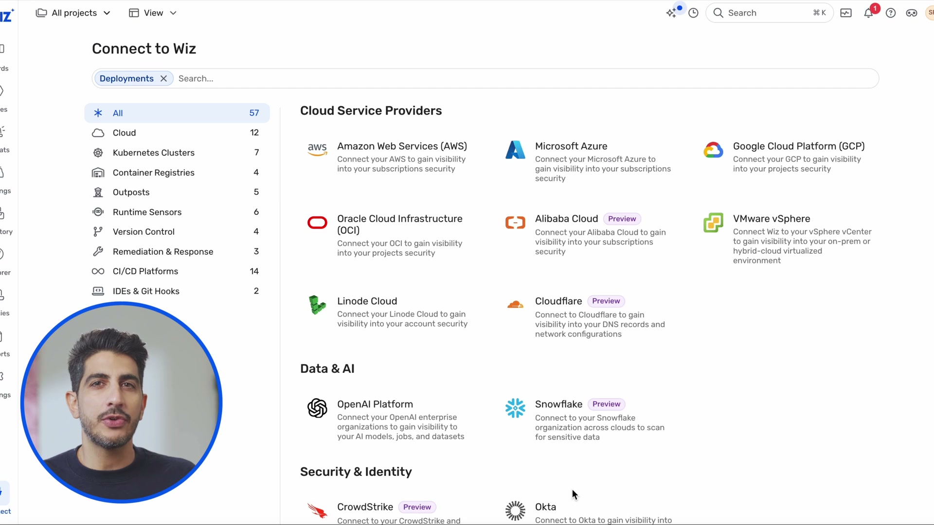
| 0030 | Connect to Wiz: integration hub with provider logos | Connector UX reference |
| 0050 | Technologies inventory: 631 items with approval workflow | Inventory management UX |
| 0070 | Security Graph landing: "Search your Security Graph" with presets | Query entry point UX |
| 0071 | AI search autocomplete: "publicly e..." with suggestions | Natural language search |
| 0073-0074 | Graph Controls list: security rules with issue counts | Policy management UX |
| 0075 | Graph Controls: compliance framework filter dropdown | Framework mapping UI |
| 0076-0077 | Graph Controls: Risk filter with MITRE ATT&CK categories | Risk categorization |
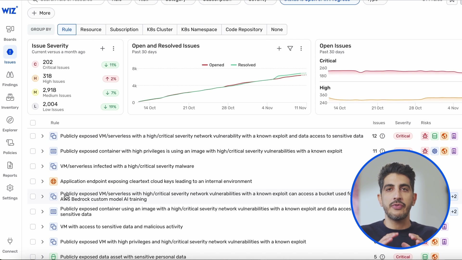
| 0080 | Issues Dashboard: severity donut, trends, issue list | Dashboard design |
| 0085 | Attack Path Visualization with S3 bucket node detail card | Inline graph + detail card |
| 0086-0087 | Vulnerability Management: impact funnel (200K -> 10K -> 4K -> 108 -> 10) | Funnel visualization |
| 0095 | Remediation panel: "Automatic Fix in Code" with PR generation | Actionable remediation |
| 0110 | Security Operations: detection pipeline funnel, MTTR, readiness gauge | Operations dashboard |
| 0115 | Threat detail with Investigation Graph inline | Inline graph in detail view |
| 0119 | Investigation Graph: process tree with node detail + event timeline | Process tree grouping + timeline |
| 0120-0121 | Detection graph: geographic origins, yellow process tree box, API action labels | Full detection graph with all patterns |
| 0125 | Code-to-Cloud with Image Layers section | Deep lineage detail |
| 0140 | New Project wizard: 4-step flow (Details, Resource Scopes, Team, Risk Profile) | Wizard UX pattern |
| 0150 | New CI/CD Policy: name, scope, lifecycle stage toggles | Policy creation UX |
Sources
- Wiz Security Graph: How It Works, Benefits, Use Cases
- The World is a graph: How Wiz reimagines cloud security using a graph in Amazon Neptune
- Wiz Security Graph offers root cause analysis for cloud IR
- Wiz for Microsoft 365: Bringing SaaS into the Security Graph
- At Wizdom 2025, Wiz Presents a Broader Vision of Cloud Security
- ReactFlow Expand and Collapse Example
- ReactFlow Sub Flows (Grouped Nodes)
- What is Attack Path Analysis? | Wiz